The project finished! The error was pretty bad, so I’m now looking into using other data/models to better predict muscle spindle output given muscle lengths and velocity. Here’s a link to the data, programs, paper, and figures for this project (which are in a .zip file at the link): < https://gitlab.com/bitSlayer29090/musclespindlemodelsanddata/-/blob/master/README.md>
How to manually digitize data in figures of scientific articles
I wanted to obtain some data that I couldn’t measure myself through taking the data from plots in figures in scientific articles, a.k.a., digitizing some data in the figures.
One way I did this was by clicking on each point in the graph while using the software PlotDigitizer. I downloaded and installed PlotDigitizer from <https://sourceforge.net/projects/plotdigitizer/>, on a 64-bit OS Lenovo 13 Thinkpad running Windows 10 Pro.
While the PlotDigitizer software’s autotrace function digitizes datapoints automatically, which would be much faster and accurate digitization than if I were to click on each point, I couldn’t get Plotdigitizer’s autotrace to work in Linux (Oracle 64-bit OS, operating system of Oracle Linux Server 7.5, Linux kernel version 4.1.12-124.15.2.el7uek.x86_64) VM (created with Oracle VirtualBox Version 5.2.12) or on Windows 10 Pro; for both Linux and Windows, I tried the .png, .jpg, bmp, .gif, .pbm, .pdf, .pgm, .pnm, .ppm, .svg, .tga, and .eps formats. (I also couldn’t get PlotDigitizer itself to work on a MacBook Air with macOS Mojave 10.14.6.)
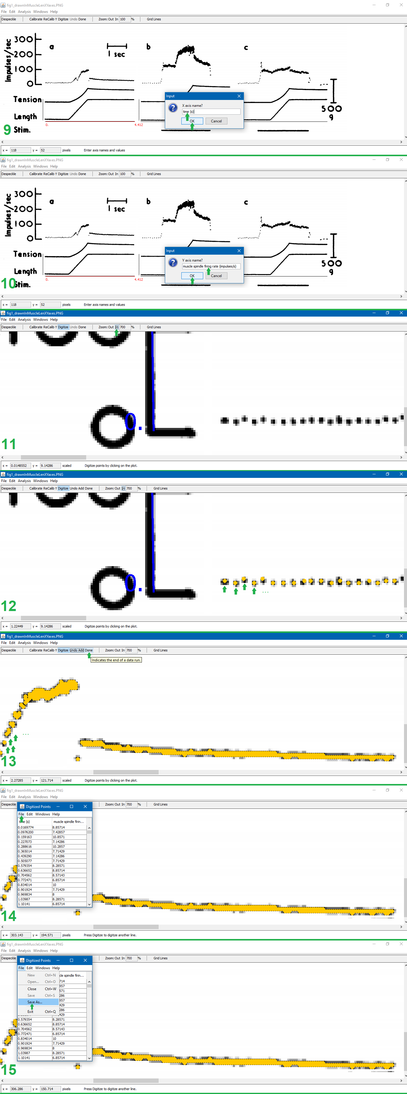
Puljak’s instructions on slides 13-28 (inclusive) of <https://training.cochrane.org/sites/training.cochrane.org/files/public/uploads/resources/downloadable_resources/2016_11_webinar_Puljak-extracting-data-from-figures.pdf> explain this process well. I add to that explanation with the below pictures, which show how to manually digitize a figure. The notes below explain each step of the below pictures.
(Note that the figure being digitized in this example is figure 1 of Matthews (1962), (digitized article 2 in this table <[]>).)
1. Open the file in PlotDigitizer. Click “Digitize.” Click on the left-most end of the x-axis.
2. Type the x-axis minimum. Click “Okay.”
3. Click on the right-most end of the x-axis.
4. Type the x-axis maximum. Click “Okay.” (The x-axis maximum was calculated by finding the number of pixels in a line with a width or height of known units which aren’t pixels. For the image shown, I determined that the 1-second measuring bar in this figure (digitized article 2, figure 1) is 68 pixels, and the x-axis length in the figure being digitized is 300 pixels, so (300 pixels)(1 s/68 pixels)=4.412 s, which is the x-axis maximum given 0 is the x-axis minimum.)
5. Click on the left-most end of the y-axis.
6. Type the y-axis minimum. Click “Okay.”
7. Click on the right-most end of the y-axis.
8. Type the y-axis maximum. Click “Okay.”
9. Type the x-axis units. Click “OK.”
10. Type the y-axis units. Click “OK.”
11. Click “Zoom: In” until zoomed in as much as possible (700%).
12. Click on each point of interest in the graph.
13. Finish clicking on each point of interest in the graph. Click “Done.”
14. Click “File” in the pop-up containing the (x,y) coordinates of all the digitized points.
15. Click “Save As…” in the drop down from the pop-up. Save the file.


Matthews, P. B. C. (1962). The differentiation of two types of fusimotor fibre by their effects on the dynamic response of muscle spindle primary endings. Quarterly Journal of Experimental Physiology and Cognate Medical Sciences: Translation and Integration, 47(4), 324-333.
How to automatically digitize data in figures of scientific articles
I was going to use the autotrace function of the software Plotdigitizer, but couldn’t get it to work, so I wrote a program using openCV [1] to digitize figures.
Get a scale. All images used were .png format, and were screenshots (taken with Microsoft Snipping Tool) of .pdf files of research papers (viewed with Google Chrome). Open the image in Microsoft Paint, use the Select Tool, and measure the length (height or width, depending on how the measuring line is aligned) (in pixels) of some line in the image which indicates how many graph units the line is. This line may be the axes (as in purple number 1, 2, 3, and 4 of Figure 7), or may be a separate bar on the side (as in purple number 5 and 6 of Figure 7). Axes may apply to several graphs (as in all graphs of Figure 7), including the graph of interest, so you may have to screenshot several unrelated graphs so that your screenshot includes the graph.
Remove lines. Remove any axes, labels, titles, legends, graph lines, or anything except the datapoints to be digitized. See Figures 8 and 9 for examples of removing guiding dots and lines which aren’t datapoints, but are the same color of the datapoints.
Run the program. Run digitize.py, which searches for the color with the blue-green-red (BGR) lower and upper bounds specified in the code, and writes each point of that color to a comma-separated values (.csv) file. See Figures 10, 11, and 12 for examples of datapoints of a certain color extracted from a graph which has curves of various colors.

Figure 7.

Figure 8.

Figure 9.

Figure 10.

Figure 11.

Figure 12.
[1] Bradski, G. (2000). The OpenCV Library, opencv-python version 4.1.2.30. Dr. Dobb’s Journal of Software Tools [Computer software]. Retrieved from https://opencv.org/releases/.
Update 1
A model that computationally predicts data which is experimentally verified with microneurography [1] that exists is that of Vannucci, Falotico, and Laschi [2]. However, the Vannucci et al. model was only validated for experimental data (from Mileusnic et. al’s [3] paper’s Figure 3) at the 0.11 decimal of optimal fiber length / s muscle stretch speed. (Optimal fiber length is unitless, since it is (current muscle length (m))/(optimal fiber length of that muscle (m)).) Vannucci’s model wasn’t validated for the 0.66 decimal of optimal fiber length / s and 1.55 decimal of optimal fiber length / s speeds, which are speeds that were also included in Figure 3 of Mileusnic’s paper. If Vannucci’s model is only accurate for a certain speed, the model can’t be used for much (it can’t be used to simulate a particularly slow or fast muscle stretch), but if Vannucci’s model is accurate for the other speeds given (.66, 1.55) then it could be used for a lot more.
Therefore, I tried to see if Vannucci’s model worked for those other speeds by running the model while the input muscle lengths stretched at those other speeds, and Vannucci’s model didn’t appear to predict muscle spindle afferent firing rates at the other speeds.
[1] <https://en.wikipedia.org/wiki/Microneurography>
[2] Vannucci, L., Falotico, E., & Laschi, C. (2017). Proprioceptive Feedback through a Neuromorphic Muscle Spindle Model. Frontiers in neuroscience, 11, 341. doi:10.3389/fnins.2017.00341
[3] Mileusnic, M. P., Brown, I. E., Lan, N., & Loeb, G. E. (2006). Mathematical models of proprioceptors. I. Control and transduction in the muscle spindle. Journal of neurophysiology, 96(4), 1772-1788. doi:10.1152/jn.00868.2005