I wanted to obtain some data that I couldn’t measure myself through taking the data from plots in figures in scientific articles, a.k.a., digitizing some data in the figures.
One way I did this was by clicking on each point in the graph while using the software PlotDigitizer. I downloaded and installed PlotDigitizer from <https://sourceforge.net/projects/plotdigitizer/>, on a 64-bit OS Lenovo 13 Thinkpad running Windows 10 Pro.
While the PlotDigitizer software’s autotrace function digitizes datapoints automatically, which would be much faster and accurate digitization than if I were to click on each point, I couldn’t get Plotdigitizer’s autotrace to work in Linux (Oracle 64-bit OS, operating system of Oracle Linux Server 7.5, Linux kernel version 4.1.12-124.15.2.el7uek.x86_64) VM (created with Oracle VirtualBox Version 5.2.12) or on Windows 10 Pro; for both Linux and Windows, I tried the .png, .jpg, bmp, .gif, .pbm, .pdf, .pgm, .pnm, .ppm, .svg, .tga, and .eps formats. (I also couldn’t get PlotDigitizer itself to work on a MacBook Air with macOS Mojave 10.14.6.)
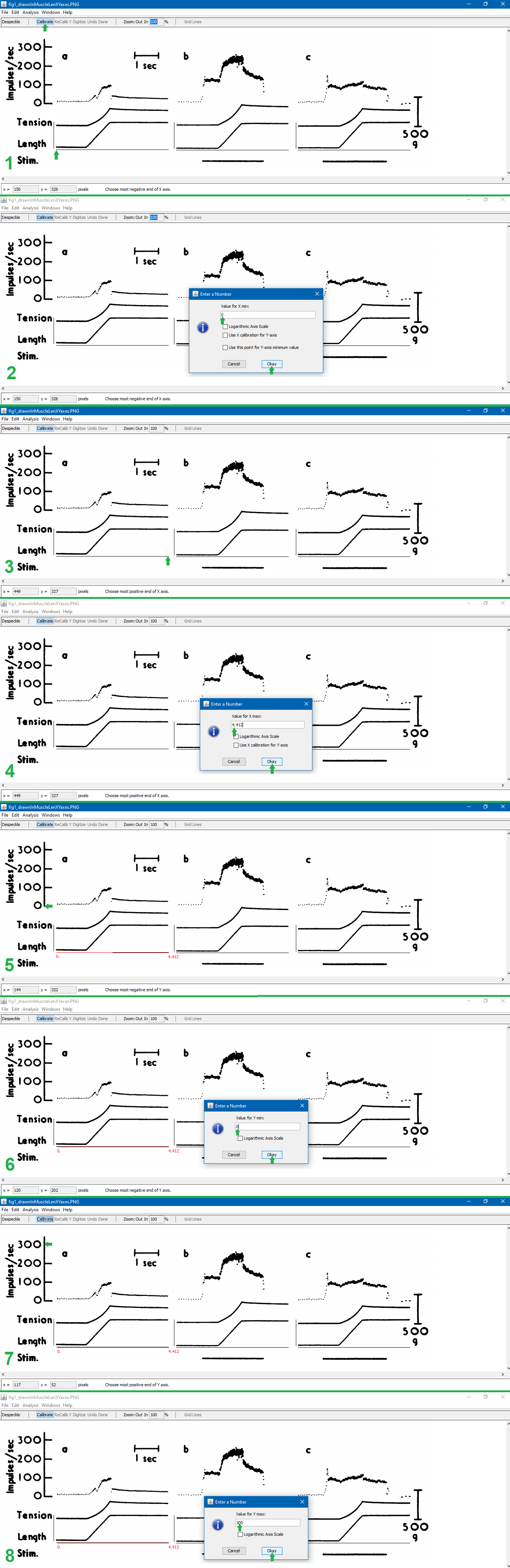
Puljak’s instructions on slides 13-28 (inclusive) of <https://training.cochrane.org/sites/training.cochrane.org/files/public/uploads/resources/downloadable_resources/2016_11_webinar_Puljak-extracting-data-from-figures.pdf> explain this process well. I add to that explanation with the below pictures, which show how to manually digitize a figure. The notes below explain each step of the below pictures.
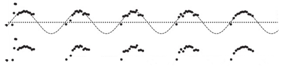
(Note that the figure being digitized in this example is figure 1 of Matthews (1962), (digitized article 2 in this table <[]>).)
1. Open the file in PlotDigitizer. Click “Digitize.” Click on the left-most end of the x-axis.
2. Type the x-axis minimum. Click “Okay.”
3. Click on the right-most end of the x-axis.
4. Type the x-axis maximum. Click “Okay.” (The x-axis maximum was calculated by finding the number of pixels in a line with a width or height of known units which aren’t pixels. For the image shown, I determined that the 1-second measuring bar in this figure (digitized article 2, figure 1) is 68 pixels, and the x-axis length in the figure being digitized is 300 pixels, so (300 pixels)(1 s/68 pixels)=4.412 s, which is the x-axis maximum given 0 is the x-axis minimum.)
5. Click on the left-most end of the y-axis.
6. Type the y-axis minimum. Click “Okay.”
7. Click on the right-most end of the y-axis.
8. Type the y-axis maximum. Click “Okay.”
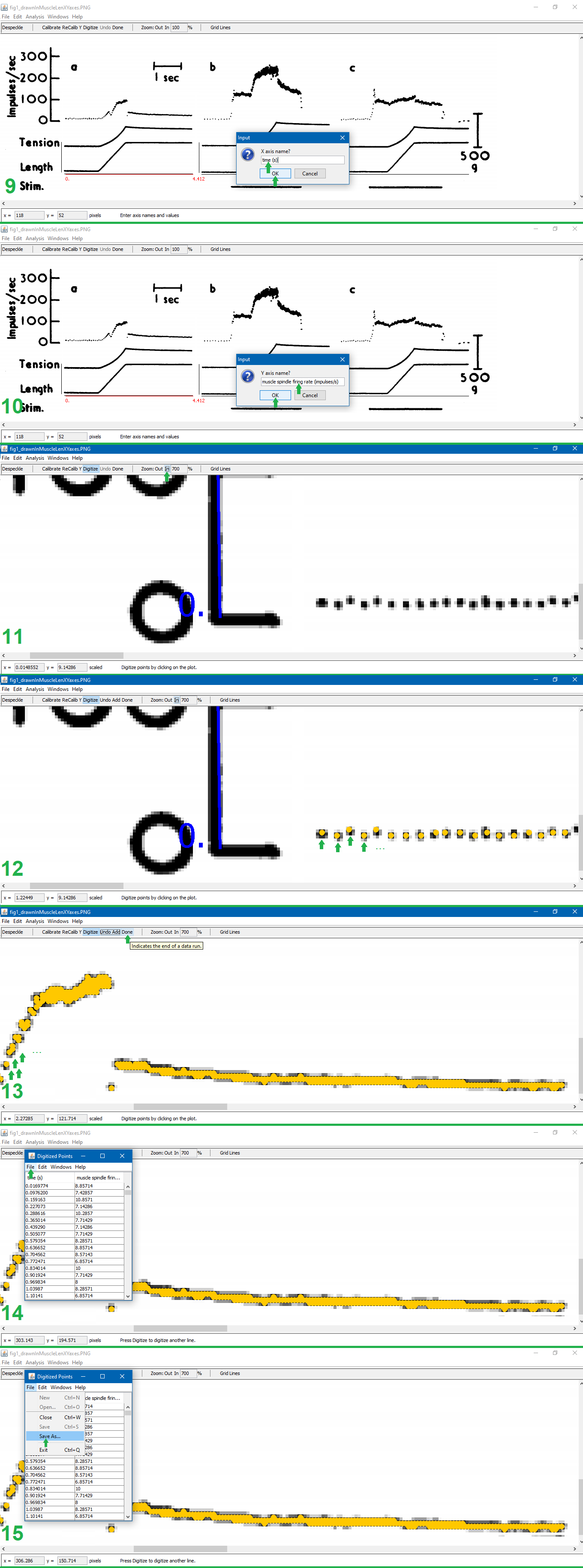
9. Type the x-axis units. Click “OK.”
10. Type the y-axis units. Click “OK.”
11. Click “Zoom: In” until zoomed in as much as possible (700%).
12. Click on each point of interest in the graph.
13. Finish clicking on each point of interest in the graph. Click “Done.”
14. Click “File” in the pop-up containing the (x,y) coordinates of all the digitized points.
15. Click “Save As…” in the drop down from the pop-up. Save the file.
Matthews, P. B. C. (1962). The differentiation of two types of fusimotor fibre by their effects on the dynamic response of muscle spindle primary endings. Quarterly Journal of Experimental Physiology and Cognate Medical Sciences: Translation and Integration, 47(4), 324-333.